It was 2011, and   everyone hated big banks 😀


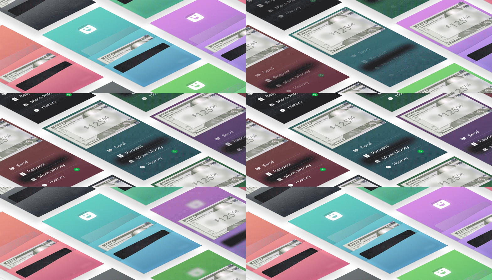
The co-founders of Clinkle were then all students at Stanford University, in the heart of the Valley. We had the same questions as everyone else: where were the cool contactless payments we craved? why was it so hard to pay each other back for small things? and, the more we thought about it:

Why isn't your wallet on your phone?

Β 


the app paid stores using ultrasound ✨


Every store had an iPad, which received payments from any Clinkle wallet. The iPad broadcast the store ID through ultrasonic noise pulses. The wallet app picked up the signal and checked the server to fetch the latest open ticket.

 
β€œA few details have leaked, however. Those who have used Clinkle say it’s an exceptionally well-designed, simple-to-use mobile wallet app that utilizes a high-frequency sound to transmit money between users in close proximity β€” no phone-bumping, QR code-scanning, texting or dongle-swiping required.”
— Alyson Shontell, Business Insider (April 14, 2014)
 

but ultrasound, it turned out, wasn't our future πŸ˜ͺ


While our ultrasound tech worked well, getting merchants to install the iPad was too difficult at scale. We learned small businesses are loath to change up their payment systems more than once a decade. We needed to marry our peer-to-peer payments with a scalable in-store payment system.


doesn't it feel good to treat a friend? 🎁


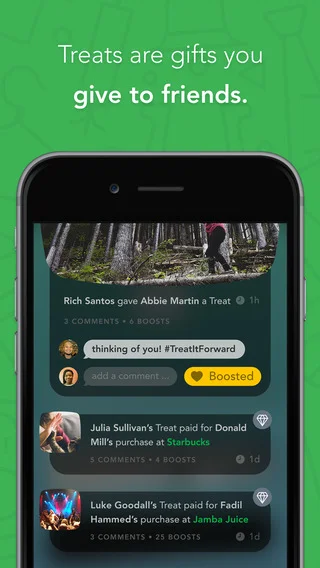
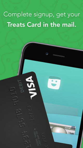
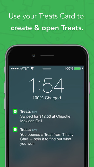
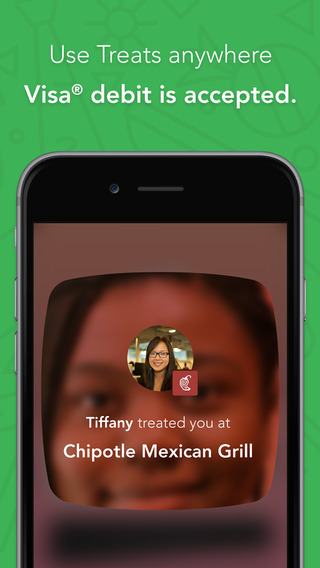
We re-branded as a new type of debit card. With the Treats app you can surprise your friends with a Treat that may pay for their purchase. Users make everyday purchases with their Treats Card to create gifts called Treats. Give a Treat to a friend, and it may pay for their purchase. Get a Treat from a friend, and it may pay for yours.


β€œβ€œThey have a very, very cool product,” says another. β€œIt does blow your mind. On paper and if you just explain Clinkle to someone it’s like, whatever β€” everyone is doing mobile payments these days. But once you see it, it’s so smooth. Rob Ryan, [lead Clinkle designer], did an incredible job with the user interface.” ”
— Alyson Shontell, Business Insider (April 14, 2014)


β€œβ€œThey’re a very driven company and they have a lot of talent,” the former employee said. β€œTheir head designer, Rob Ryan, is the best asset of their company … that’s why it looks so good and functions so well.””
— Billy Gallagher, TechCrunch (Jun 27, 2013)
 
β€œOur team at Clinkle slaves over surprise and joy. We build physical toys. We script and direct movies with outside production firms. We prototype far-out hardware tech. We illustrate the office walls. We patent novel UI controls. We bend physics to animate the universes we imagine. We hire musicians to soundscape our UI. And we sprinkle easter eggs liberally across our product, so there’s always something playful to discover.”
— β€œSurprise and Joy,” by Rob Ryan

Treats bet the house on kindness


The Treats app launched to the US college market, with the team crossing their fingers for user engagement. (Lesson learned: always be user testing). The design team supported that launch across web, video ads, on-campus events, ambassador swag, email campaigns, you name it.


video


on-Campus swag

"Khamari got his $20 bill and free t-shirt, come get yours now! #treatitforward #treatyoself"

"fresh shirts just in @clinkle"

We offered students at the TreatsBot free swag in exchange for posting about the event


web marketing


in-app promo content


TreatsBot promotion

In late 2014, the CEO took the company's leadership to an off-site, to brainstorm fixes for dismal user acquisition numbers. At the time, we were paying on-campus groups up to $20 per enrolled user. Even with $20 as bait, only 9% of the students wanted to sign up for a new debit card. A fundraising round was coming up: we needed to 10x user acquisition within a month.

Reframe: how could we offer $20, and hook students every time?

With a magical vending machine full of $20 bills, of course! I bought a fleet of six snack vending machines, reskinned them, stocked them with $20 bills, and rewired the TreatsBot to only vend a bill when a new user pays the Bot 1Β’.

It was outrageously successful.


Concept by Rob Ryan, Illustration by Matt Chalwell (m.chalwell@gmail.com)

Direction by Rob Ryan

Illustration by Justin Pervorse

Direction by Rob Ryan

Illustration by Justin Pervorse

The TreatsBot promotion soon became the company's most effective acquisition strategy


email marketing

Clinkle's customers are overwhelmingly college students. Marketing to students over email means mobile-first designs with plenty of humor and joy.


police are killing innocent people across America


It's taken years for mainstream media to give real credence to police violence. Marginalized populations (especially African-Americans and Latinos) have insisted for years that police can be indiscriminate with force, attack innocent children, and cover-up their crimes. Now we have video proof.


in reply, three friends and I made Megaphone

Megaphone is an app for iOS and Android that streams video anonymously and publicly. As soon as you open the app, it's already streaming video anonymously to our website, and geo-tagged so other activists can see it.


Android experience


brand identity

An important cause deserves a strong identity. The team knew we were looking for a brand that connects with activists but isn't overtly hostile to police (like "CopStop," our first name). The mark itself needed to plucky; it shouldn't echo violence, but offer a way to fight it. And the brand overall needed feel like a public amenity, not a Valley video-streaming app.

I drew on the blocky line-art of the activist Keith Haring for the mark. The plucky little walking megaphone marches undaunted, with her recording light winking boldly in front of her. The word "megaphone" is intended as entendre: the app is both a familiar activist tool and should make your phone mega. The type is Interstate, a close match for public road signs across America. And for the color palette, I balanced an overtly socialist red with neutral techy tones.


website


timelapse of UI design

Megaphone is an app that streams video anonymously and publicly. I designed the UI for the Android pilot app in three hours, and happened to record my screen in the meantime.